Overview
The aim of this project was to produce a fictitious interface for a hotel brand called Palm Grove Hotels, based in Mallorca. The hotel chain consists of three luxury hotels on the island. The end goal was to produce a seamless user experience for users who wanted to book a stay at one of the resorts.
Responsibilities
• User research - survey collating, usability testing and competitive benchmarking
• Producing Affinity diagrams, user flow diagrams and customer journey maps
• Sketching
• High Fidelity prototyping and annotating
Duration
July - November 2024
Research Stage
Competitive Benchmarking
User Surveys
Usability Testing
Competitive Benchmarking
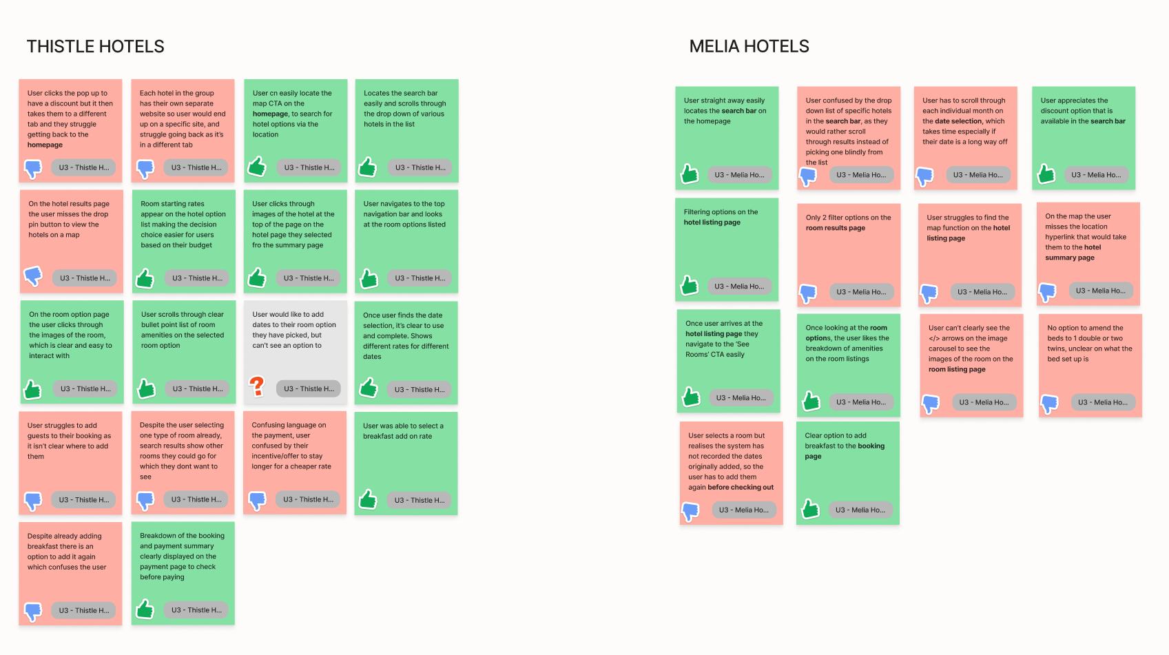
To build a better understanding of hotel booking websites, I reviewed three different hotel websites, as well as an aggregator site to compare nuances in the booking journey, from searching for a stay, right through to confirming a booking highlighting the positive, negative and neutral aspects on each page in the journey.
Common Themes
• Limited Images, that don't show a clear depiction of the hotel or the rooms
• Unclear pricing breakdowns, prioritising member prices
• Information about the hotel itself not forthcoming, for websites where there is an option to pick from multiple.
• Clashing colours on the UI, making it difficult to read

Research Stage
Competitive Benchmarking
User Surveys
Usability Testing
User Surveys
In order to learn more about real life user habits for approaching hotel websites, I conducted a survey where I could gather and analyse qualitative and quantitive data from a set of real users who had recently used online hotel or aggregator websites for their own holiday booking.
Key Takeaways
• Users found pricing and location the most important factors when booking hotel accommodation
• Users stated they wanted clearer costs when booking, and were put off when sites didn't display this clearly.
• Most users would complete the booking in one sitting, instead of researching further and coming back to a site.
Research Stage
Competitive Benchmarking
User Surveys
Usability Testing
Usability testing was a remarkably interesting part of the research, seeing first hand what users struggled with and how websites didn't work as expected. I studied and took notes on two usability tests on two different websites, before undertaking my own on another two to get a wider scope.
Key Takeaways
• Users often expected to know what hotel they wanted to stay at, when in some cases they wanted to browse options to find one that would fit their needs location wise.
• Repetition of information, which meant the user doubted if the website had taken into account what they had already input, e.g, dates.
• Lack of location information, causing the user to wonder if a hotel was by a beach for example.
• Images, as well as the usability of the image viewing interface was very important
• Reviews for the hotels was important to some users to determine if they wanted to stay there.
Analysis Stage
Affinity Diagram
Customer Journey Map
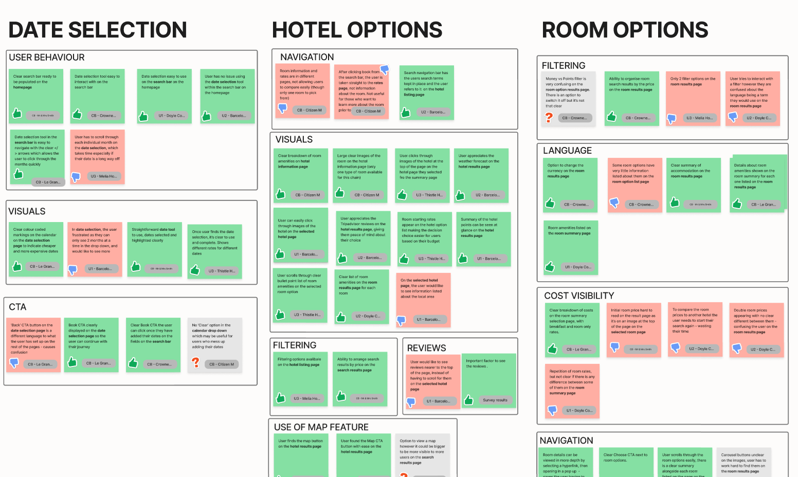
With the information gleaned from research, it was time to look at what patterns were emerging. To look at this I worked on an affinity diagram, where I was able to pull together the raw data, sorting them into various groups where I could see familiarities in various stages.
Once categorised I then drilled down to subgroup the data into smaller categories that focused on specific aspects like language, filtering ability, reviews, map navigation.
Analysis Stage
Affinity Diagram
Customer Journey Map
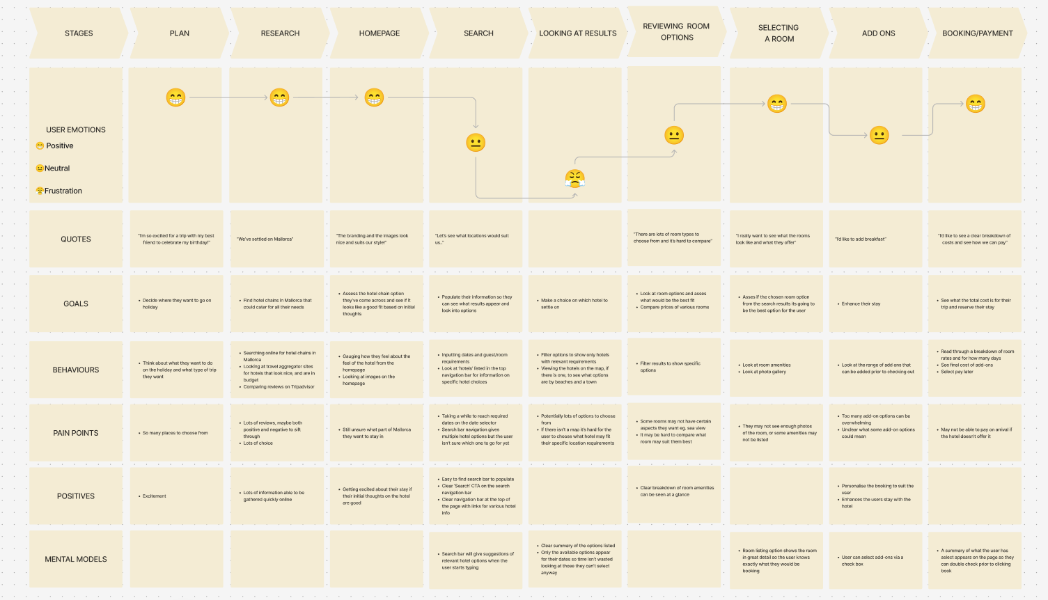
To build a typical user journey I mapped out the states and behaviours a typical user would go through from their initial thought, through to booking their stay. I focused on goals, behaviours, pain points, positives and mental models.
The persona was based on a user called Emily, who wanted to book a stay in Mallorca with friend for a few days for a summer getaway.
Designing the UI
User Flow
Interaction Sketches
Hight-Fi Wireframes
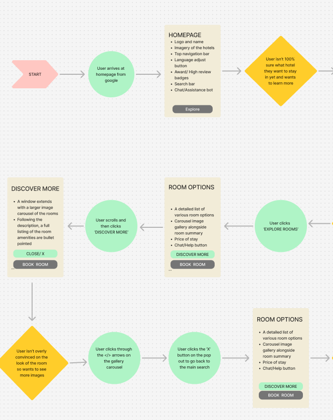
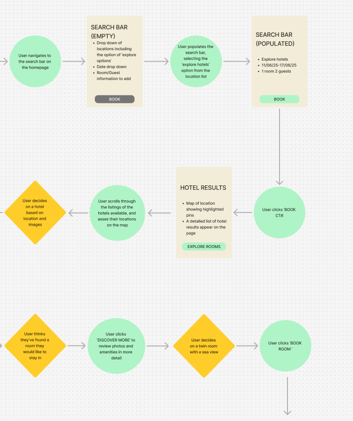
I built a user journey flow which maps out how I expect the user to interact with the various stages of the booking system. The journey focused on one user in particular and how they would approach a typical booking. The flow focuses on decisions they would have to make as well as what CTAs they would select in order to move to the next stage.
Designing the UI
User Flow
Sketches
High-Fidelity Prototype
It was then time to put pencil to paper and sketch out how I wanted the various pages to look like. I knew this would develop as I started to build the prototype, and then user test it, so this served as a starting point.

Designing the UI
User Flow
Interaction Sketches
High-Fidelity Prototype
After sketching out the flow of how I expected the website to run, I turned to Figma to produce a working high-fidelity prototype.
Below I've gone into more detail on certain design decisions, and what my rational was behind them.
Please feel free to interact with the prototype below and follow the user flow scenario outlined.
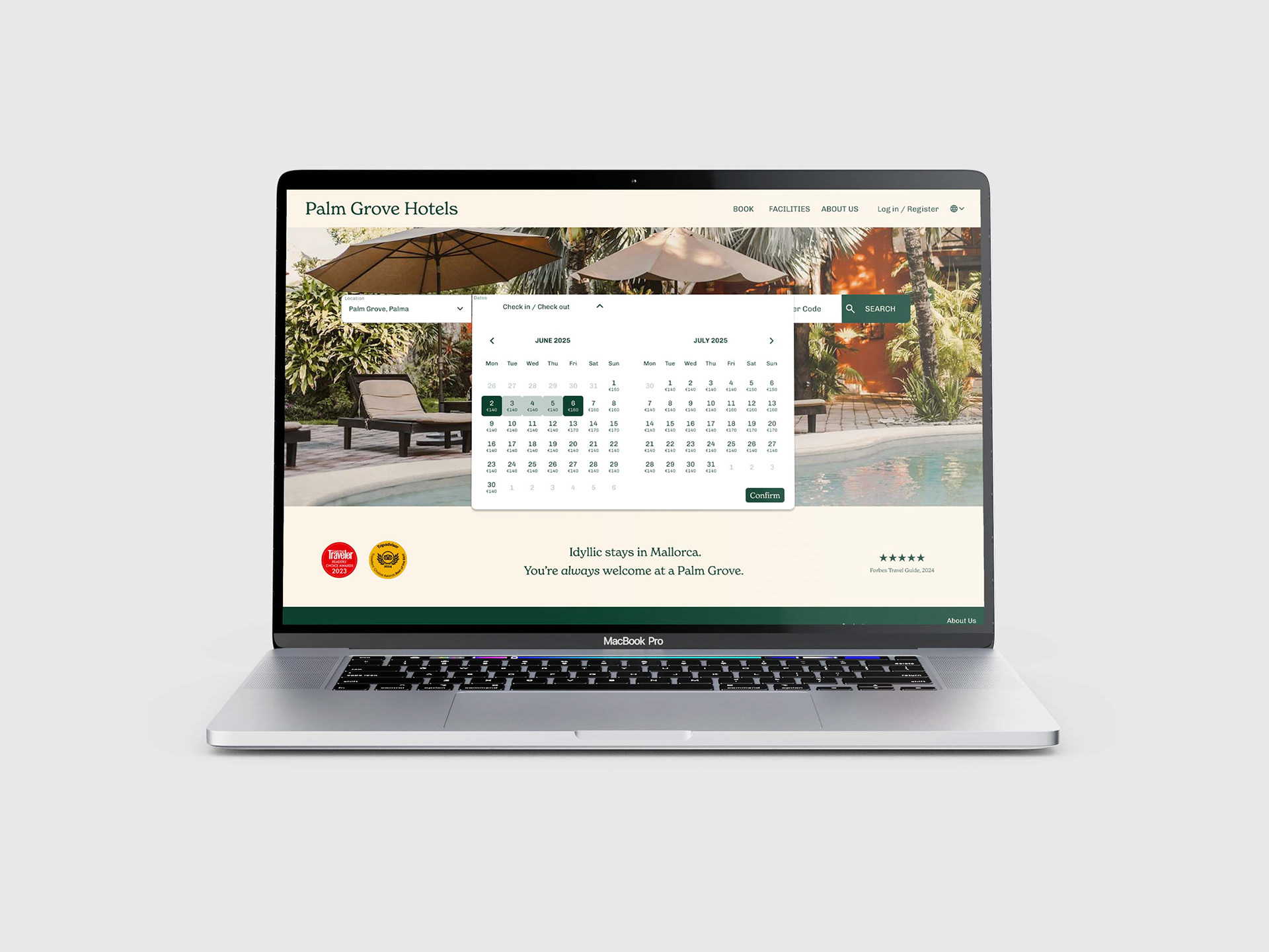
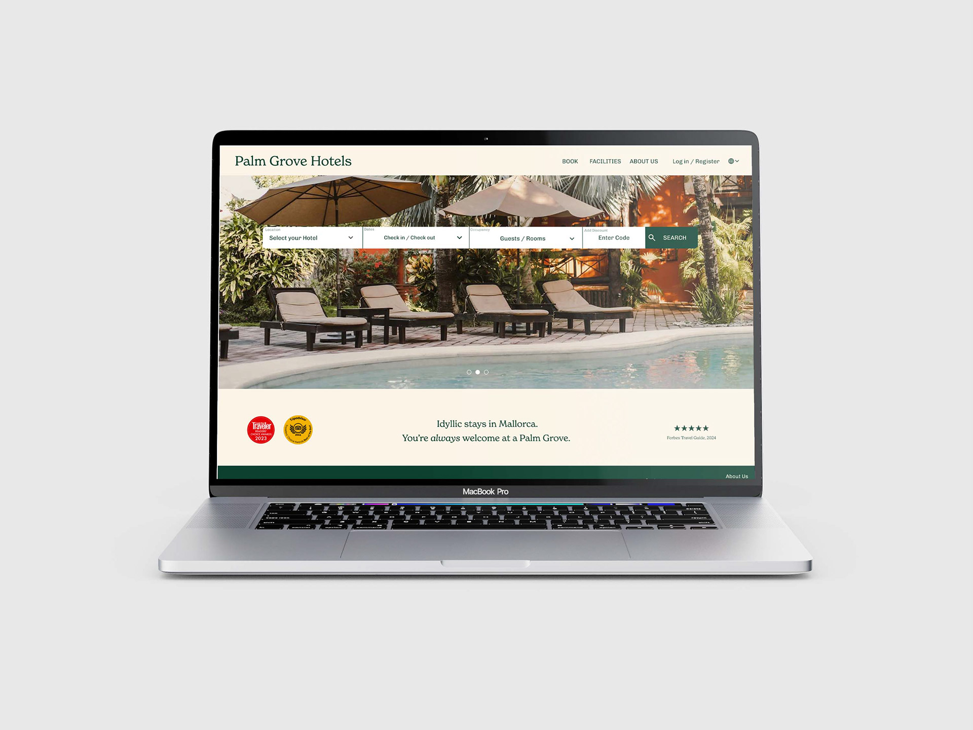
Navigation Bar
On the landing page, I've placed this centrally, with clear, labeled steps for the user to go through in order to enter their information. In the destination field I've included the option to 'Compare All' so users can review all the hotels in the chain, rather than selecting one, if they are looking to weigh up options.
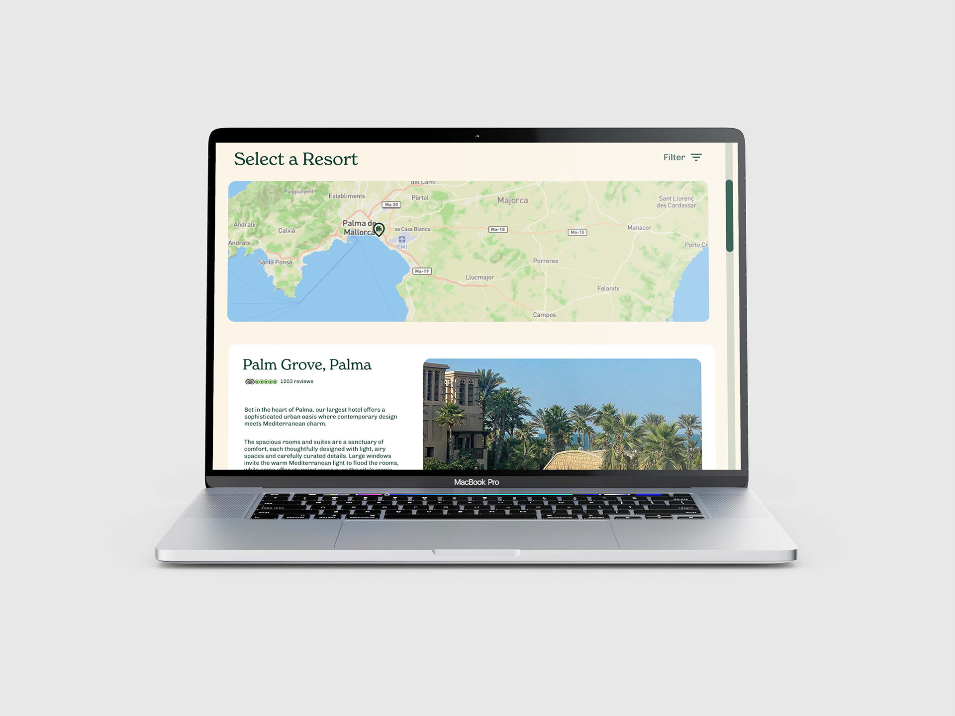
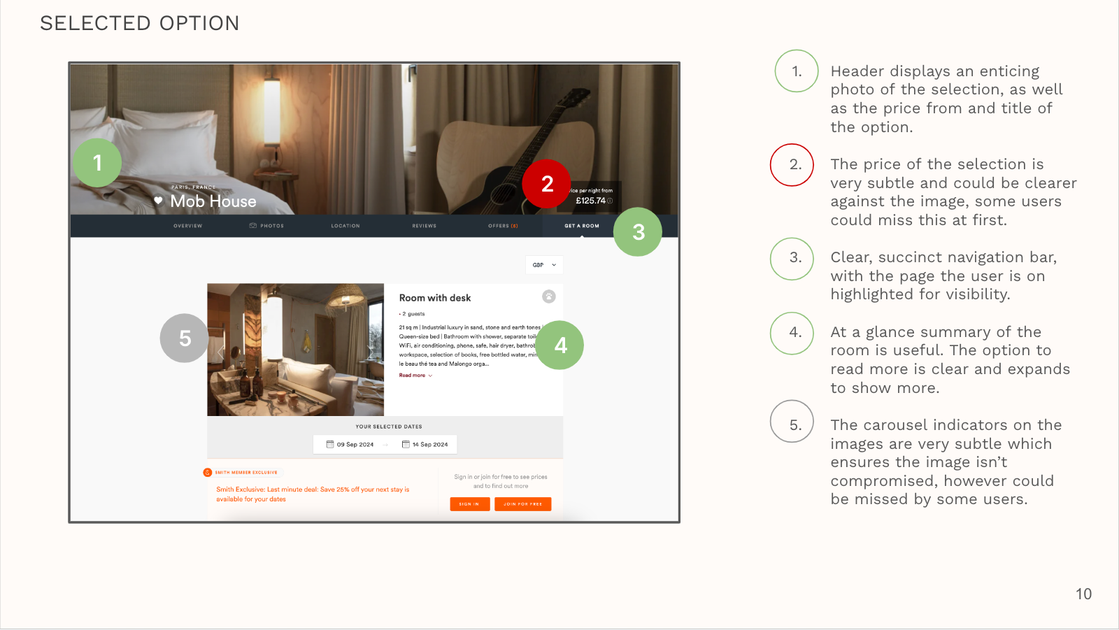
Hotel Options
In user research, users would be frustrated with the fact they would have to pick a certain hotel before knowing all options available to them, and the fact they couldn't see at a quick glance, where the hotel may be. In order to combat this I've included a map which highlights on a map the various hotel locations. When, on hover, the user can see the hotels name, and when the button is pressed the user is taken to a card which shows a summary of the hotel, with amenities listed, room rates and images.
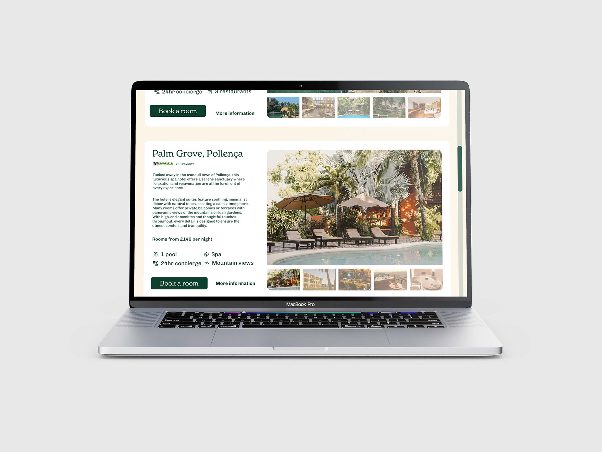
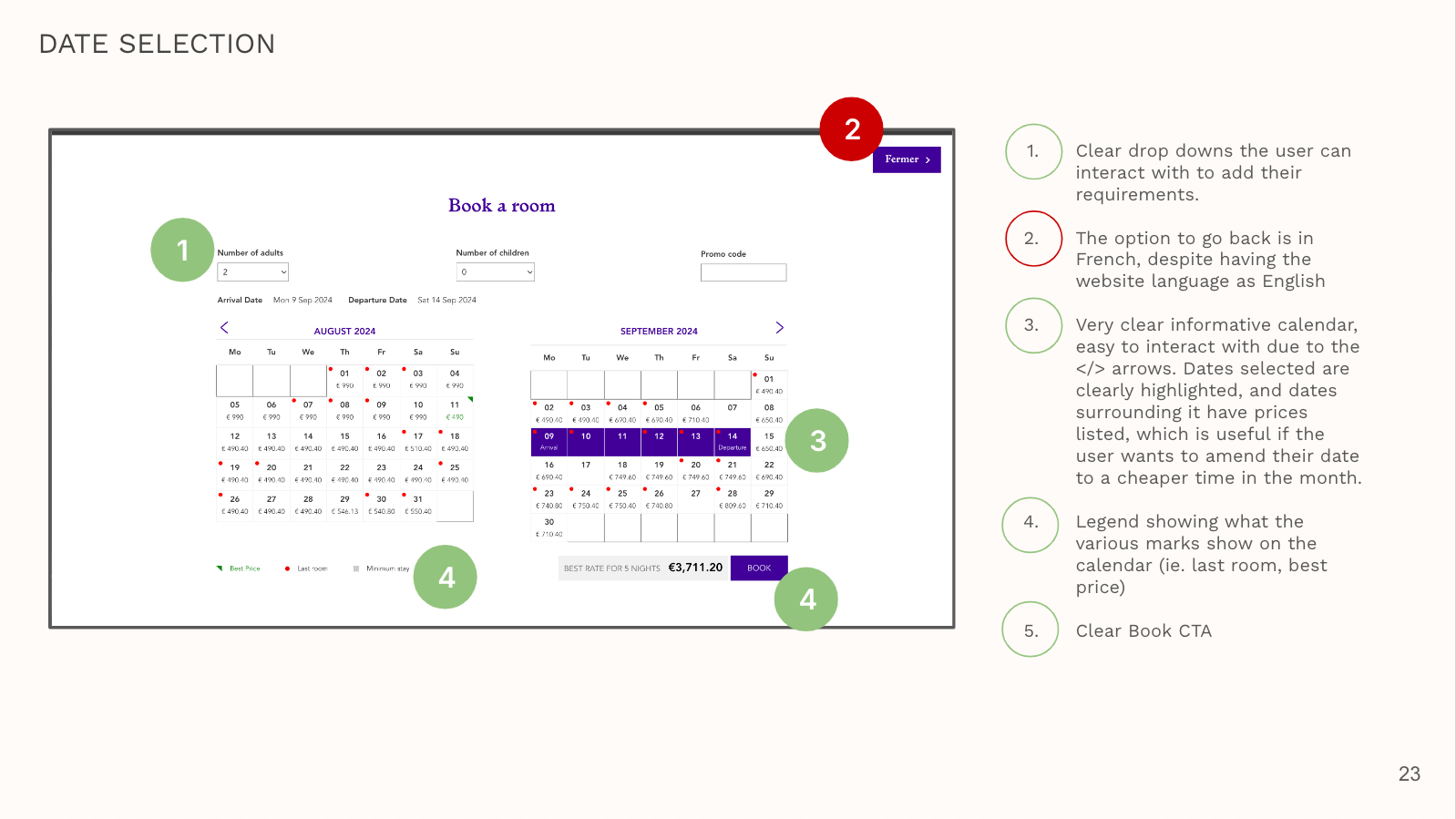
Limiting Options in some cases
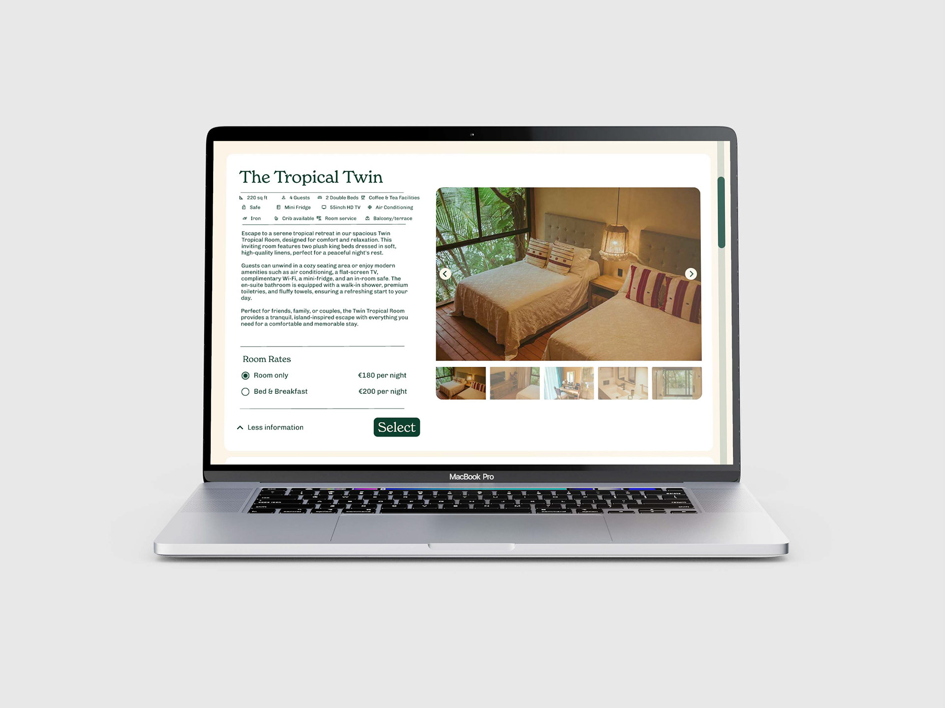
In research users had stated they found lots of choice to be overwhelming to them at certain points in the journey, ringing true to Hick's theory. To combat this I kept room types to a minimum, as well as add-ons you could incorporate to your booking.
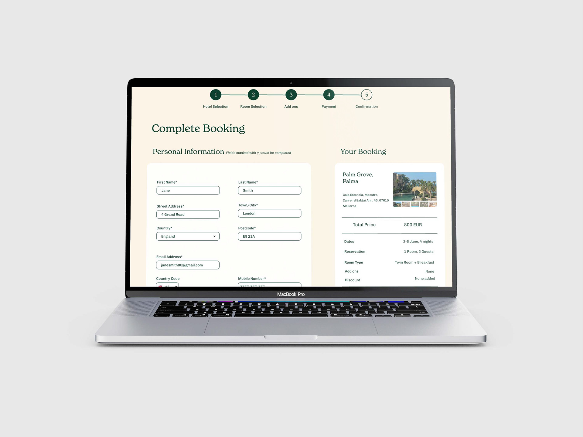
Progress Indicator
In some cases booking a service on a website can be time consuming, and leave the user wondering how much longer it may take to complete their request. In this case I've designed a progress indicator which shows the user how many more stages they need to go through in order to complete their booking.
Feedback and Iterations
Usability Testing
Once I had worked on building a prototype, it was important to get a real life feel for how users interacted with it. I tested it out on users to see how it faired.
What's worked well so far?
• Users picked up on visual cues for interacting with the photo carousels to see more images
• User found the map tool useful for seeing where a hotel was
• User could clearly navigate through the stages of check out page
What could have gone better? What can I learn for next time?
• User missed checkboxes on the room rate selection. To combat this I changed all checkboxes to radio buttons, with an option pre-selected to give a clear understanding the the user an option must be picked. The radio buttons I implemented are slightly bigger than the original checkboxes, and were not missed when tested with the next user.
• The user not scrolling down far enough to see various options below the map on the hotel selection page. The map took up most of the top part of the screen so I minimised it so the user could quickly move onto the hotel list if they didn't want to use the map.
• Ensuring the whole of the navigation dropdown is interactive, as some users will use chevron or specific dropdown icons to expand or collapse a dropdown, and others would prefer to click anywhere on the field.